Salt & Pepper—The Art of Illustrating Texture
椒盐噪声— 插图艺术的阐述
Learn four different texture techniques using Adobe Illustrator and Photoshop.
使用Adobe Illustrator和Photoshop学习四种不同的纹理技术。
In the world of illustration you sometimes need to add depth and tactical representation to objects. There are many ways to achieve this digitally, using things like gradients, heavy color contrasts, patterns, textures, etc.
在插图的世界里,有时你需要给予对象赋予深度和策略的表现。有很多方式可以实现这种数字化,使用渐变、深色对比,模式、纹理等思想。
For the past few months I’ve been experimenting and tooling different ways to incorporate textures into my illustrations. After countless hours of exploring, and numerous conversations with fellow Illustrators, I’ve discovered a few different solutions I’m happy to share. This article covers four texture techniques using Adobe Illustrator and Adobe Photoshop, and is intended to play to your own tooling strengths.
在过去的几个月中,我一直在实验和使用不同的方式将纹理融入到我的插图路。经过不停地探索,以及与其他众多插画师谈话无数个小时后,我发现了一些不同的解决方案,现在我很高兴与大家分享。本文介绍使用Adobe Illustrator和Adobe Photoshop制作的四个纹理技术,当然也看你使用软件的造诣。
Before we get started
在开始之前
This article is intended for novice Adobe Illustrator and Photoshop users. To keep the read as short as possible, I’ve skipped over the application tooling basics to get straight to the goods as fast as possible.
这篇文章面向Adobe Illustrator和Photoshop的新用户。为了让它言简意赅,我已经跳过了软件使用基础部分直接说我们的操作。
But before we jump into the formulas, let’s understand the methodology as it applies to all techniques.
在我们一头扎紧教程之前,让我们理解一下这项被应用到所有技术上的理论。
The Salt & Pepper Methodology
椒盐噪声理论
When cooking with salt and pepper, a little can go a long way. The same rule applies when illustrating. A dash of tint with a pinch of shade can bring a whole new dimension or emotion to a composition. As a general rule, tints refer to highlights or brighter areas, and shades are the shadows or darker areas of a specific color or object.
当用椒盐做饭的时候,差之毫厘谬以千里。这种规则同样适用于插图。带阴影的色彩可以带来一种全新的感受,就好像把维度或者说感情色彩相融合。从常理讲,色彩指的是高亮或亮色区域,而色调是阴影或特定的颜色或对象的较暗区域。
We’ll be using two main attributes in both of the applications. The first is blending modes, and the second is transparency. For the tinted textures we’ll use the Overlay blending mode. For the shaded textures we’ll use the Multiply or Color Burn blending mode.
我们将在这两个应用程序使用两个主要属性。第一种是混合模式,并且第二个是透明度。对于浅色的纹理,我们将使用叠加混合模式。对于阴影贴图,我们将使用内嵌或颜色加深混合模式。
Below you can see an example using three layers:
下面你可以使用三层看一个例子:(本来是动图,太大了传不上来,截图了,分别是俯视图和正视图)
1.alt layer — Overlay blending mode; low transparency.
1.ALT层 - 覆盖混合模式;透明度低。
2.Pepper layer — Multiply or Color Burn blending mode; low transparency.
2.Pepper层 - 嵌入或颜色加深混合模式;透明度低。
3.Solid vector shape(s)—Object you wish to apply tints and shades to.
3.纯色矢量形状(S)-禁止你所期望的色彩和色调的应用(这句翻译不来。。)。
The techniques
技术
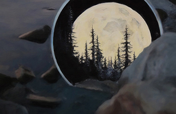
For all of the techniques we’ll use the same simple, illustrative object — an orange — so you can see the different results in comparison. An orange works particularly well because it has a great shape and material texture. OK, ready to learn the four techniques?
对于所有的技术,我们将使用同样的例子,我们的插图:一个橘子, 以便你可以看到不同的效果。橘子的效果特别好,因为它有一个很棒的形状和材料质感。 好的,准备好学习的四种技术了吗?
1. Illustrator & Grain Effects
1. Illustrator & 纹理效果
The first technique uses Illustrator and the pre-built Photoshop raster effects. This technique applies a noisy/grainy style to the object. Follow the steps below in Illustrator:
第一种技术使用Illustrator和预构建的Photoshop栅格效果。该技术适用于噪声/纹理风格的对象。Illustrator中的步骤:
Steps for Technique 1
技术步骤1
Create the solid shape(s) you wish to add tints and highlights to (in our case, the orange). Lock the layer.
创建实心图形并添加你喜欢的色调和高光(在本例中使用橙色)。锁定图层。
Add two layers above the first. Label one Multiply and the other Overlay.
添加上述前两个图层。打开一个新选项卡新建一个内嵌图形和另一个图层。
In the Multiply layer create an ellipse (circle) the same size as the orange with a linear gradient fill. The gradient fill should go from white (#ffffff) to black (#000000). Also adjust the gradient angle as you wish. In our case the light source is coming from the top left, so our shade should be opposite of the light in the bottom right of the object. For this example the angle of the gradient is -60º. Finally change the white in the gradient to 0% opacity.
With the gradient object selected go to Effect > Texture > Grain. You should then see a modal with texture settings.
On the right of the modal, select Stippled for Grain Type. Then adjust Intensity and Contrast to achieve the texture effect you’re looking for. Select OK.
With the layer still selected, change the Blending mode to Multiply or Color Burn and drop the Transparency down to 10–15%.
Align your Multiply object over the solid shape (the orange in our example).
Once you’re satisfied with the results lock the Multiply layer.
In the Overlay layer create an ellipse with a linear gradient that goes from white to black and adjust the angle so the white color is closest to the light source. Change the opacity of the black to 0%.
Repeat steps 4 and 5.
With the object still selected, change the Blending mode to Overlay and drop the Transparency to 15–20%.
Align the Overlay layer over your object and that’s it. Salt and Pepper!
Download Sample File
Technique #1 Notes:
You can get different grain effects by selecting various Grain Types from the Effects > Grain dropdown menu.
Take the time to experiment. Other options like Effects > Sketch > Reticulation can work as well, and you can get some really great results by stacking the effects.
This technique also works with Mesh Gradients instead of Linear Gradients.
2. Illustrator & Raster Bitmap Masks
The second technique uses raster Bitmap images to create the textures. This technique can be a bit hefty on your processor. If you have a slow machine I would avoid this technique or use it sparingly.
Steps for Technique 2
In Illustrator create the solid shape(s) you wish to add tints and highlights to (in our case, the orange). Lock the layer.
Add two layers above the first. Label one Multiply and the other Overlay.
On the Multiply layer place a bitmap image in the position where you’d like to add shade to your object. You can view a sample bitmap image in the downloadable sample file below.
Change the fill color of the bitmap image to black(#000000).
Then create an Ellipse (circle) the same size as the orange with no fill or stroke. Select both the Ellipse and the bitmap image, then select Object > Clipping Mask > Create. Finally align the masked bitmap image directly over the orange below it.
With the masked bitmap image selected, in the Transparency panel change the Blending mode to Multiply or Color Burn and drop the Transparency value to 10–20%.
Next select the Overlay layer and place the bitmap image where you’d like to add a tint or highlight to your object.
Then change the fill color of the bitmap texture to white(#ffffff).
Repeat step 5.
With the masked bitmap image selected, in the Transparency panel change the Blending mode to Overlay and drop the Transparency value to 10–20%. Voilà, Salt & Pepper success!
Download Sample File
Technique #2 Notes:
In order to alter the fill color in Illustrator, the raster texture must be in a Bitmap format.
You can also use gradient color fills with this technique.
3. Power Textures with Illustrator & Photoshop
If you‘re wanting a unique paint brush effect with realistic strokes and/or realistic textures, this technique is for you.
Steps for Technique 3
Open up Photoshop and create a new file the same size as your Illustrator Artboard. Also open the vector design in Illustrator. In our example, it’s the orange.
In Illustrator select the entire orange object and select Edit > Copy. Next open up Photoshop and select Edit > Paste. Then you should be prompted with Paste As options—be sure to select Smart Object.
In the layer panel create two layers above the smart object layer. Label one layer Multiply and the other Overlay.
Next change the blending modes of the Multiply layer to Multiply and Overlay for the Overlay layer.
In the layers panel select all three layers and then select the folder icon in the bottom of the panel. This will place all three layers into a group.
Next select the smart object layer only, then use the Magic Wand Tool to select the entire orange object. If done correctly you will see animated dashed lines outlining the orange.
In the layers panel select the folder or group. Then select the Add Layer Mask in the bottom of the layers panel (the icon is a rectangle with a circle void). This will mask the entire group (all three layers).
Next select the Brush Tool, then select a texture brush of your choice from the bush presets panel. Also make sure you have a black (#000000) fill for your foreground color in the toolbar.
In the layers panel select the Multiply layer and start brushing in the shade area on the bottom right of the orange. You can avoid adding too much texture but lowering the opacity of the brush.
Next select a white (#ffffff) fill for your foreground color in the toolbar.
Then select the Overlay layer in the layers panel and start brushing in the tint area on the upper left of the orange. You can avoid adding too much texture by lowering the opacity of the brush.
Finally take a look at your overall composition. If the textures appear too drastic, you may need to lower the transparency of the Multiply and/or Overlay layers. That’s it, you’re done!
Download Sample File
Technique #3 Notes:
If you’re wanting to increase saturation and add shade to your smart object(s), you might want to use the Color Burn blending mode rather than the Multiply blending mode which just adds shade.
You can really get some great effects by using multiple brushes—especially if you’re using a pressure-sensitive graphics tablet.
A great resource for simulating realistic brushes in Photoshop is .
4. SVG Textures
This technique uses light code to create textured illustrations for the browser. The reason I added this is because of how low the file size is. You might have a unique challenge where you want to use a scalable illustration—let’s say for a responsive site—and desire subtle textures.
Steps for Technique 4
Follow the same steps as the first technique except when it comes to applying the Effect > Grain (step #4). Instead, use Effect > SVG Filter > AI_Static, then follow the remaining steps (#5–12) from Technique 1.
Download Sample File
Technique #4 Notes:
Compare the difference in file size for SVG and PNG at 2x to see if this technique is worth it. In the example above, the SVG is 4KB and the PNG is 82KB. On a high-traffic site, the size difference can yield a huge improvement in browser rendering.
When saving SVG Options for the web, be sure to check Minify and Responsive before saving.
Choose wisely and use sparingly
Above is a side-by-side comparison of the four texture techniques
Each of the four techniques are visually very similar. Define your style direction then figure out which technique works best for your end goal. Also consider the tools you’re comfortable with: If you’re short on time, stick to what you know; If you’re an Illustrator guru with a powerful CPU, you can implement fantastic textures right in Illustrator; If you’re creating a large amount of different textures, I’d suggest using Illustrator + Photoshop in combination.
Just like cooking, too much salt and pepper can ruin a dish. I’m a strong believer in, “If it doesn’t taste good, don’t serve it.” The same rule applies here—thus the name. Use textures sparingly. Too much and your objects might appear flatter than when you initially started. I know it’s fun to add more and more, but you have to remind yourself of their value. Always apply textures with purpose.
Thanks for reading and best of luck with your future Illustration projects :).
原文地址:/google-design/salt-pepper-the-art-of-illustrating-texture-c962dc67cc35
如果觉得《Salt Pepper—The Art of Illustrating Texture》对你有帮助,请点赞、收藏,并留下你的观点哦!