
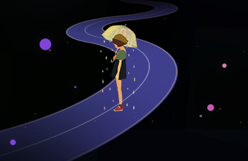
目标
我们要实现的目标效果如下
过渡如何使用
可以清楚地看出效果图中的效果用到了css3中的过渡transition,先来了解一下transition
CSS3 过渡是元素从一种样式逐渐改变为另一种的效果
过渡共有四个属性,分别是:
transition-property: 规定应用过渡的 CSS 属性的名称
transition-duration: 定义过渡效果花费的时间。默认是 0
transition-timing-function: 规定过渡效果的时间曲线。默认是 “ease”
transition-delay: 规定过渡效果何时开始。默认是 0
其中,transition-property和transition-duration是必填的,否则动画无法生效
1. transition-property:
transition-property属性指定CSS属性发生变化时的过渡效果(注意,不是所有css属性都支持过渡),过渡属性取值如下:
none:没有属性会获得过渡效果。
all:所有属性都将获得过渡效果。
property:定义应用过渡效果的 CSS 属性名称列表,列表以逗号分隔。
例:
element {/*单个属性*/transition-property:width;/*属性名称列表*/transition-property:width, height;/*全部支持过渡的属性*/transition-property:all;}
2. transition-duration:
transition-duration 属性规定完成过渡效果需要花费的时间(以秒或毫秒计)
例:
element {transition-duration: 2s;transition-duration: 200ms;}
3. transition–timing-function:
transition-timing-function:属性指定切换效果的速度。此属性允许一个过渡效果,以改变其持续时间的速度,取值:
linear: 规定以相同速度开始至结束的过渡效果(等于 cubic-bezier(0,0,1,1))。
ease: 规定慢速开始,然后变快,然后慢速结束的过渡效果(cubic-bezier(0.25,0.1,0.25,1))。
ease-in: 规定以慢速开始的过渡效果(等于 cubic-bezier(0.42,0,1,1))。
ease-out: 规定以慢速结束的过渡效果(等于 cubic-bezier(0,0,0.58,1))。
ease-in-out: 规定以慢速开始和结束的过渡效果(等于 cubic-bezier(0.42,0,0.58,1))。
cubic-bezier(n,n,n,n): 在 cubic-bezier 函数中定义自己的值。可能的值是 0 至 1 之间的数值。
补充最后一个贝塞尔曲线速度曲线生成网站:https://cubic-/
写法:
element {transition-timing-function: linear|ease|ease-in|ease-out|ease-in-out|cubic-bezier(n,n,n,n);}
4. transition-delay:
transition-delay 属性指定何时将开始切换效果。transition-delay值是指以秒为单位(S)或毫秒(ms)
例:
element {transition-delay: 5s;transition-delay: 20000ms;}
5. 简写
直接使用transition属性即可实现简写,写法如下
transition: property duration timing-function delay;
实现效果
步入正题,该如何实现开头的效果呢,话不多说,直接上代码
<!DOCTYPE html><html lang="en"><head><meta charset="UTF-8" /><title>Title</title><style>ul {display: flex;}ul li {display: flex;justify-content: space-around;align-items: center;position: relative;list-style: none;width: 200px;height: 140px;margin: 80px 20px;background-color: #fcfcfc;border-radius: 20px;border: 2px solid #ccc;}ul li .index {width: 40px;height: 40px;background-color: cornflowerblue;text-align: center;line-height: 40px;transition: all 0.8s;border-radius: 50%;}ul li:hover {cursor: pointer;border-radius: #000;background-color: #f4f4f4;box-shadow: 0 2px 4px rgba(0, 0, 0, 0.12);border: 2px solid #333;}ul li:hover .index {color: #fff;background-color: crimson;transform: rotate(-360deg);}.dog {position: absolute;width: 100px;height: 100px;border-radius: 50%;transition: all cubic-bezier(0, 0.7, 0.37, 1.35) 0.8s;opacity: 0;z-index: -1;}.dog img {width: 100%;height: 100%;}ul li:hover .dog {transform: translate(90px, -92px) rotate(20deg);opacity: 1;}.keyframes {display: none;width: 200px;height: 200px;animation: fadep 3s infinite linear;}</style></head><body><ul><li><div class="dog"><img src="./img/扁平头像-boy 02.png" alt="" /></div><div class="index">1</div>生活不止眼前的苟且</li><li><div class="dog"><img src="./img/扁平头像-boy 03.png" alt="" /></div><div class="index">2</div>生活不止眼前的苟且</li><li><div class="dog"><img src="./img/扁平头像-girl 06.png" alt="" /></div><div class="index">3</div>生活不止眼前的苟且</li></ul></body></html>
代码可以直接运行,记得改自己的图片地址
如果觉得《CSS3过渡动画实现hover人物弹出炫酷效果案例》对你有帮助,请点赞、收藏,并留下你的观点哦!